Subscriber Growth
Subscriber Growth
Design, testing, and analysis: Growing The Intercept's email list by 30% in 4 months
Design, testing, and analysis: Growing The Intercept's email list by 30% in 4 months
As the sole designer, I designed the email wall interface, configured analytics tracking, and analyzed performance data to drive optimizations that resulted in 30% list growth.
As the sole designer, I designed the email wall interface, configured analytics tracking, and analyzed performance data to drive optimizations that resulted in 30% list growth.
Role: Senior Growth Designer (Sole Designer)
The Team: Membership Director, 1 Lead Engineer
Scope: UI/UX design and strategy, A/B test configuration, analytics
Timeline: 4 Months
Problem
Drop offs & data gaps: A high friction funnel with a 70% bounce rate and 30% analytics discrepancies that muddied user growth data.
Problem:
Drop offs & data gaps: A high friction funnel with a 70% bounce rate and 30% analytics discrepancies that muddied user growth data.
Solution
Full-Stack Growth Design: I led A/B testing on email wall strategy and value props, while acting as a product manager/analyst to build a "source of truth" and reduce user friction.
Solution:
Full-Stack Growth Design: I led A/B testing on email wall strategy and value props, while acting as a product manager/analyst to build a "source of truth" and reduce user friction.
Result
4x Conversion Lift: I increased rate from 1.5% to 6.0%, captured 100K+ new users, and grew the total list by 30% in 4 months.
Result:
4x Conversion Lift: I increased rate from 1.5% to 6.0%, captured 100K+ new users, and grew the total list by 30% in 4 months.
Owning the relationship with our readers in a declining industry
As a nonprofit investigative newsroom, The Intercept is funded entirely by philanthropy and reader donations. Email capture powers our membership program by creating a loyal list for fundraising appeals, and helps sustain our audience relationships beyond search algorithms and social media.
We needed to grow our email list and convert casual readers into email subscribers at scale.

End-to-End ownership: From design to data
We had limited resources: no dedicated product manager, no data analyst, just me as the sole designer. Working with our Membership and Product director, I needed to:
Design conversion-optimized email capture experiences
Collaborate with engineering on implementation
Own the workflow of configuring analytics to track the right metrics, running A/B tests, analyzing performance data
Report results to editorial and leadership stakeholders
This forced me to become fluent in both design craft and growth analytics—a combination that became essential to driving measurable impact.
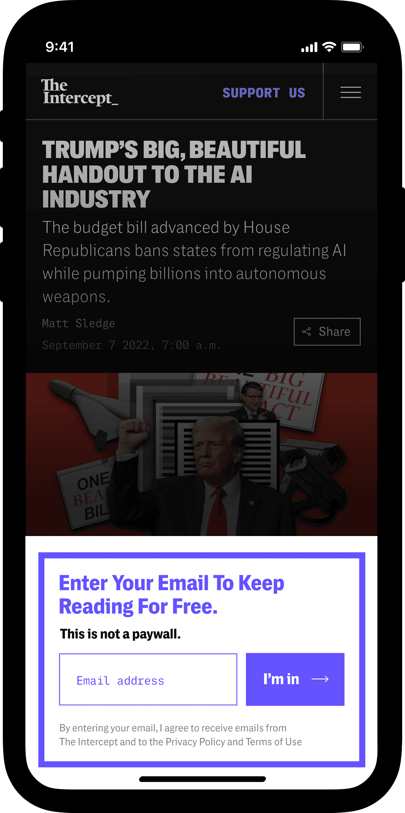
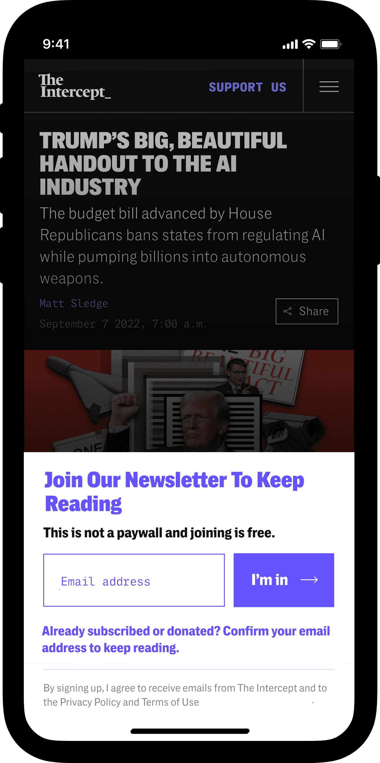
Designing the email capture
Some form of email capture is extremely common on today’s news sites. The challenge for us, as a reputable but relatively lesser-known brand, was to convince readers to give us a valid email address when they don't already know us, but do want to read our stories.
“Freemium”
Initially, we allowed readers access to one “free article” that could be read without the email capture. The popup was dismissible on the first article and persistent on the next.
Designing the email capture
Some form of email capture is extremely common on today’s news sites. The challenge for us, as a reputable but relatively lesser-known brand, was to convince readers to give us a valid email address when they don't already know us, but do want to read our stories.
“Freemium”
Initially, we allowed readers access to one “free article” that could be read without the email capture.
Article metering user experience
Article metering user experience
1st article
2nd article
2nd article
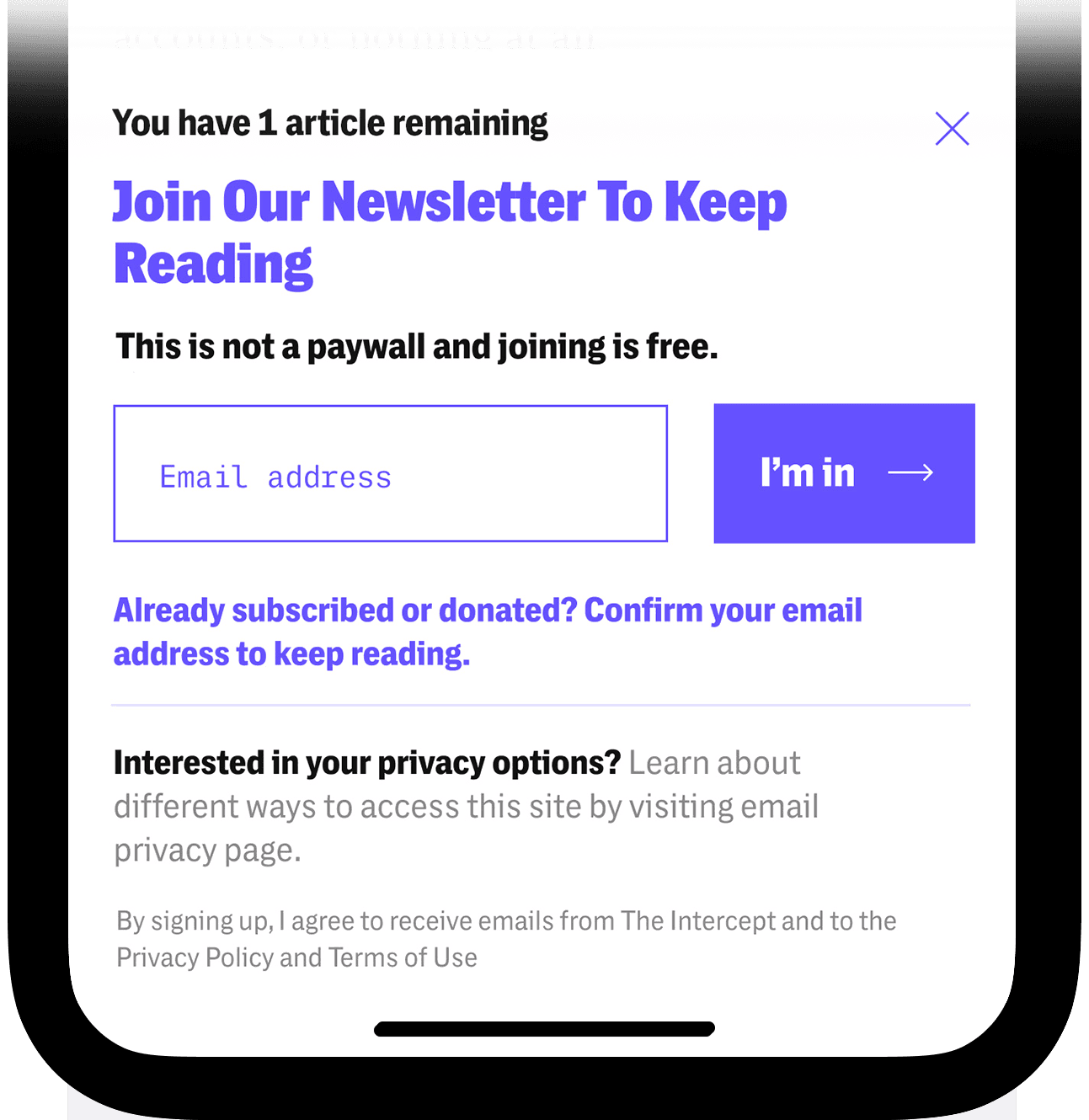

Results:
There were roughly 2x more conversions on the 1st article popup - not because it was more successful, but because we had a drop of returning readers.
70% of readers were one article readers.
Pivot:
We moved to remove the metered experience and started email capture on 1st article.
“Try before you buy”
From scroll-depth tracking, we had a sense that most readers get to ~30% down the page of an article. I came up with this design hoping that by allowing readers to see a three-paragraph preview, we would be capturing readers who show genuine interest.
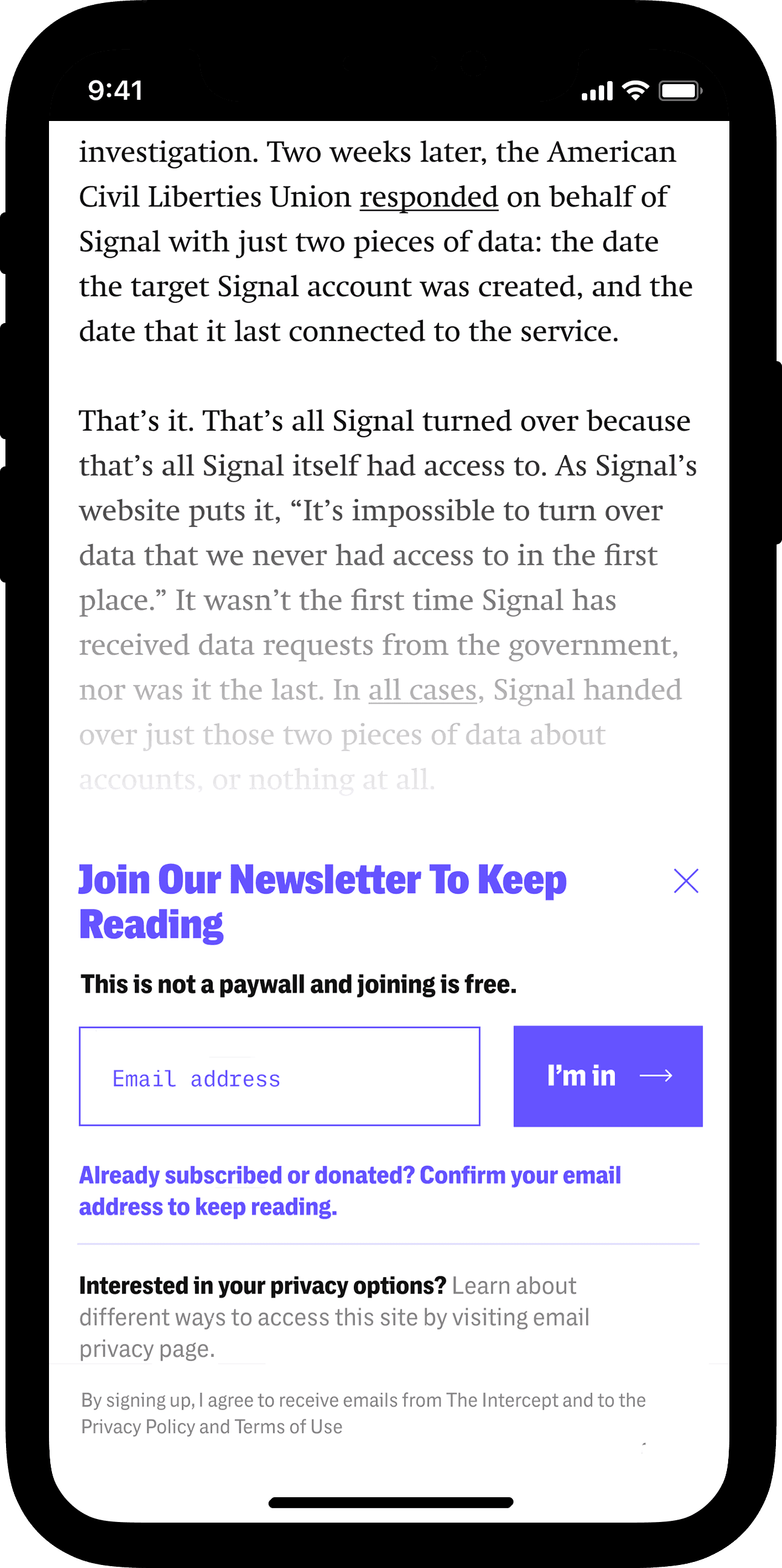
A version of the email wall offered a three-paragraph preview so the reader was able to “try before buying”.
A version of the email wall offered a three-paragraph preview so the reader was able to “try before buying”.
We saw that the fully-gated version without a preview performed better in testing.
"Try before you buy" preview
"Try before you buy" preview
Results:
We actually found that conversions decreased significantly when we gave readers a preview. Readers who scrolled 30% had already gotten what they needed. The winning version was the 'harsher' option—the popup appeared immediately at the bottom of the article. Even though readers could technically scroll the page underneath, we saw no meaningful engagement with that content. They either bounced, signed up with a real address, or entered a fake one to bypass the wall.
The preview gave readers just enough to feel satisfied without committing. The immediate ask forced a real decision.
Pivot:
We went with the fully-gated option without a preview.
Finding language that actually converts
Testing our value proposition with mission-driven language
I led a larger effort to use more language on the site which contrasted our journalism against those of our mainstream media competitors: we hold power to account, and our site is free to read and is not inundated with advertising.
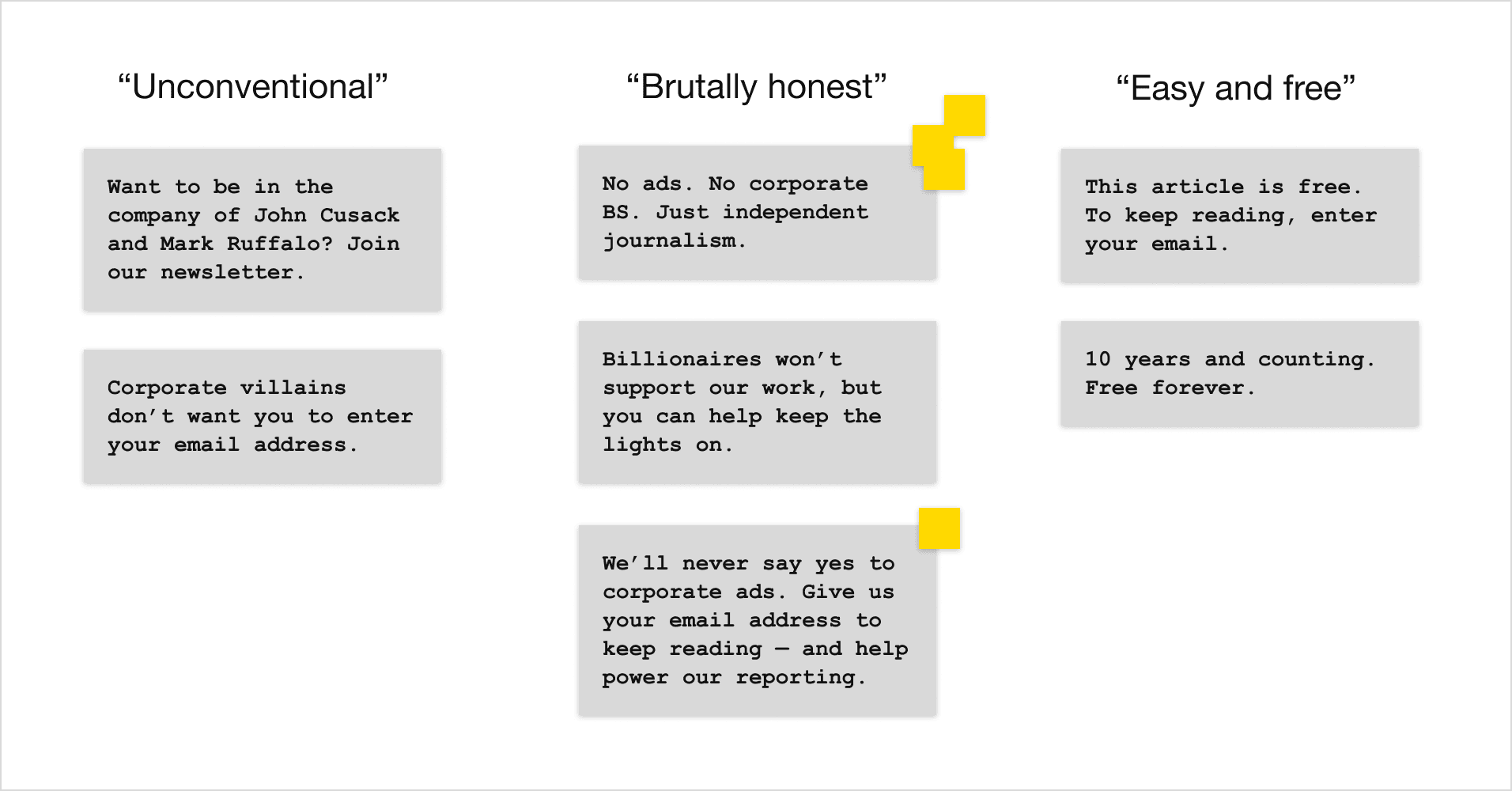
From the brainstorming sessions with the newsroom, the theme of "brutally honest" allowed us to express the brand position in the media landscape. It was also entirely new language.
From the brainstorming sessions with the newsroom, the theme of "brutally honest" allowed us to express the brand position in the media landscape. It was also entirely new language.
Join Our Newsletter To Keep Reading
Join Our Newsletter To Keep Reading
No ads. No corporate BS. Just independent journalism for free.
Stories you won’t see anywhere else. Straight to your inbox.
5% conversion
7% conversion
7% conversion
5% conversion
Results:
"No ads. No corporate BS. Just independent journalism for free." won our three-way verbiage test.
Streamlining the sign-in flow
We discovered that 5-7% of email addresses entered in our sign-up field were already in our system—readers were using "sign up" to bypass the wall instead of signing in. This created confusion and muddied our data.
We tested removing the separate "sign in" link, simplifying the interface to a single entry field.
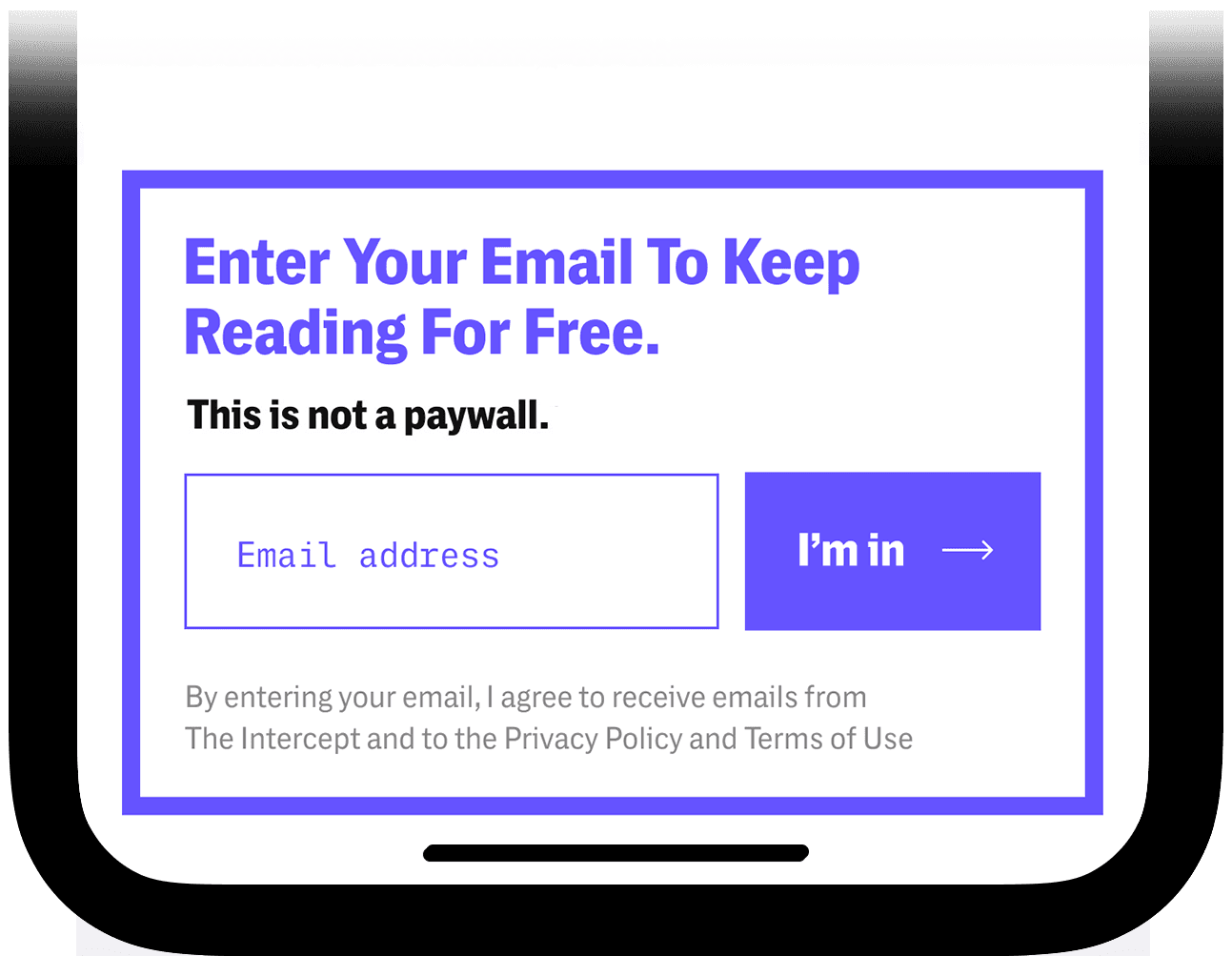
Final design
Final design
Results:
The streamlined version improved conversion by reducing friction and making the action clearer at a glance—while also giving us cleaner data on actual new sign-ups.
Results:
The streamlined version improved conversion by reducing friction and making the action clearer at a glance—while also giving us cleaner data on actual new sign-ups.
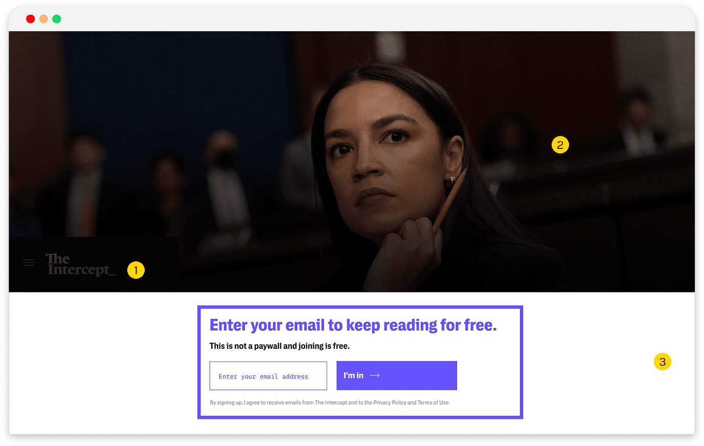
Desktop experience: different context, different design
Most new readers discover our articles on mobile (3x more than desktop), but our data showed desktop readers were far more likely to donate.
After optimizing the email signup, I focused on what desktop readers see beneath the wall: the article layout itself. We introduced a new design with improved navigation and layout optimized for desktop browsing.
Before
Before
1. Logo not visible
2. Large photo without headline
3. Email capture covered headline
After
After

1. Site navigation with categories visible
2. Headline and subheads fully visible
Results:
Adding the article headline and sub-navigation above the email ask created a smoother, more continuous experience and increased signups by 10%.
Results:
Adding the article headline and sub-navigation above the email ask created a smoother, more continuous experience and increased signups by 10%.
Building the testing & analytics infrastructure
Before optimizing conversion, I needed reliable measurement systems.
Setting up A/B testing
I managed the complete testing infrastructure:
Configured custom A/B testing tool built by our engineering team
Set up event tracking across Google Analytics, Looker Studio, and our CRM
Designed experiments with clear hypotheses and statistical significance thresholds
Questions I tested
Which messaging converted better? How did desktop vs. mobile users differ? What form fields created friction?
Solving data integrity issues
During testing, we discovered 20-30% discrepancies between our analytics tools and CRM data. I couldn't trust results without reliable data.
I worked with our Chief of Product and vendors to diagnose tracking issues, bot traffic, and inconsistent definitions. Fixing these established a single source of truth and ensures the 4x conversion improvement was based on validated data.
Building the testing & analytics infrastructure
Before optimizing conversion, I needed reliable measurement systems.
Setting up A/B testing:
I managed the complete testing infrastructure:
Configured custom A/B testing tool built by our engineering team
Set up event tracking across Google Analytics, Looker Studio, and our CRM
Designed experiments with clear hypotheses and statistical significance thresholds
Questions I tested:
Which messaging converted better? How did desktop vs. mobile users differ? What form fields created friction?
Solving data integrity issues
During testing, we discovered 20-30% discrepancies between our analytics tools and CRM data. I couldn't trust results without reliable data.
I worked with our Chief of Product and vendors to diagnose tracking issues, bot traffic, and inconsistent definitions. Fixing these established a single source of truth and ensures the 4x conversion improvement was based on validated data.
What we achieved
These results directly supported The Intercept's membership growth goals and created a sustainable pipeline for
fundraising appeals.
Grew email list by 30% from baseline
Increased conversion rate from 1.5% to 6.0% across all variants
Generated 100K+ new email subscribers for membership and fundraising programs
Improved mobile conversion by 10% through device-specific optimization
With the testing infrastructure now in place, the team is equipped to run iterative experiments independently, shifting the newsroom culture toward a truly data-informed growth model.